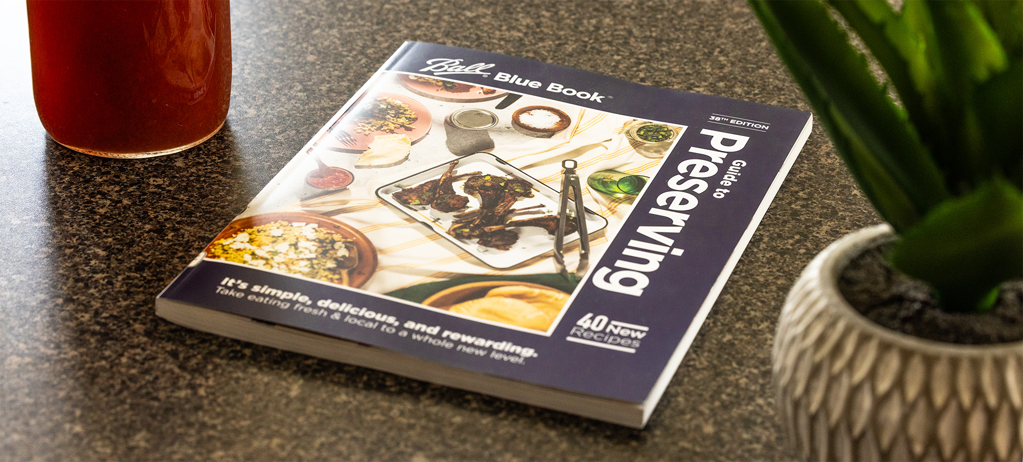
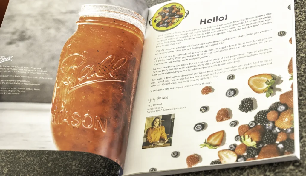
The Ball Blue Book is a longstanding staple in home canning. For its 38th Edition, Newell Brands aimed to modernize the design while preserving its trusted legacy. The goal: a refreshed, contemporary look that could proudly sit on shelves while still feeling familiar to Ball’s loyal community.
Client
Newell Brands (via Willow Marketing)
Roll
Art Director
Year
2023
Scope of Work
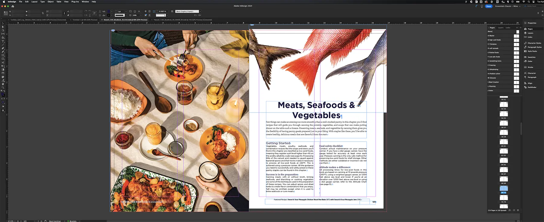
Art Direction
Book Design & Layout
Cover Redesign
Collaboration with Photographers
Index Creation Oversight
File Prep for Print
Design Approach
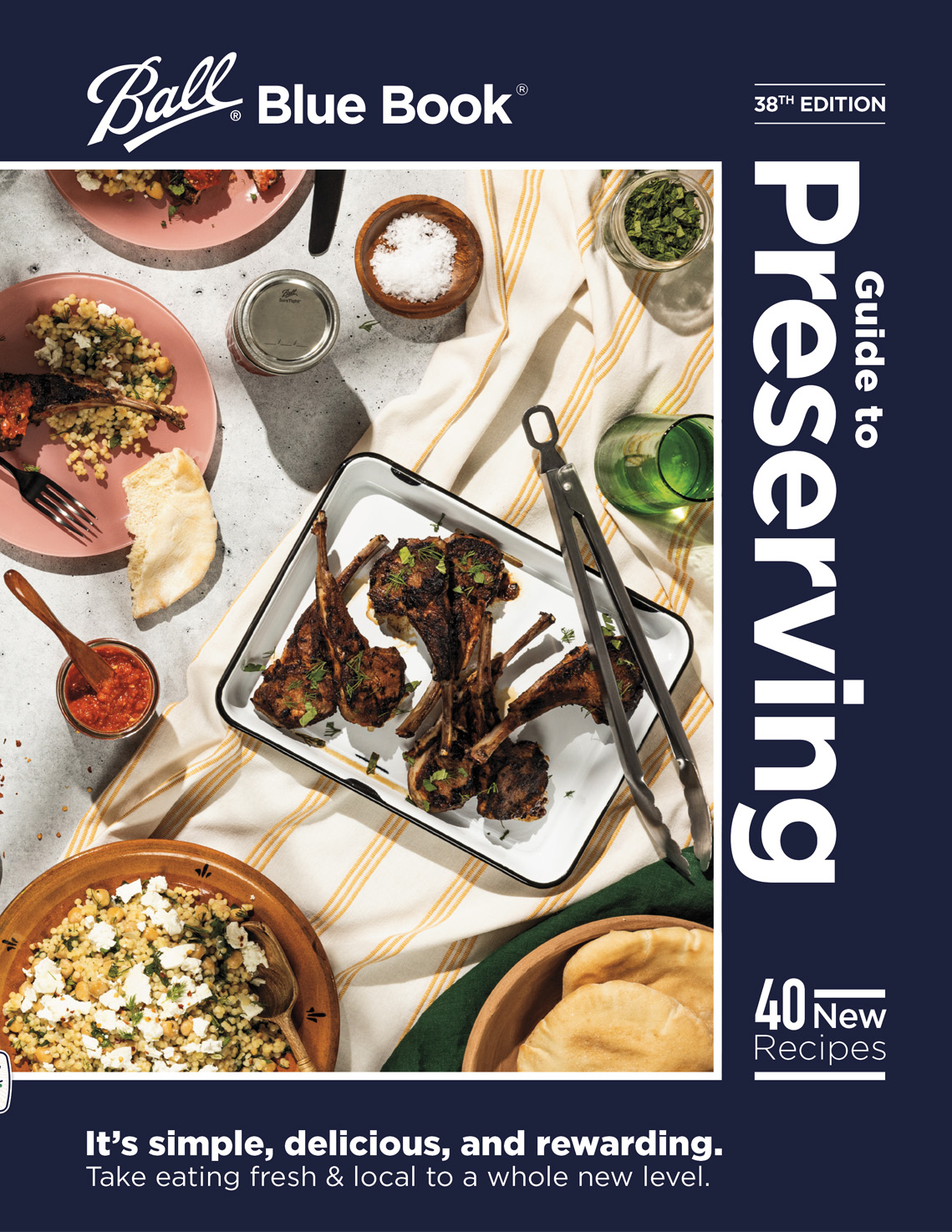
We moved away from the dated aesthetic of previous editions and introduced a clean, modern, and minimal visual language. A big visual change was bringing the iconic blue back to the cover, reinforcing the Ball brand’s heritage in a bold, fresh way.
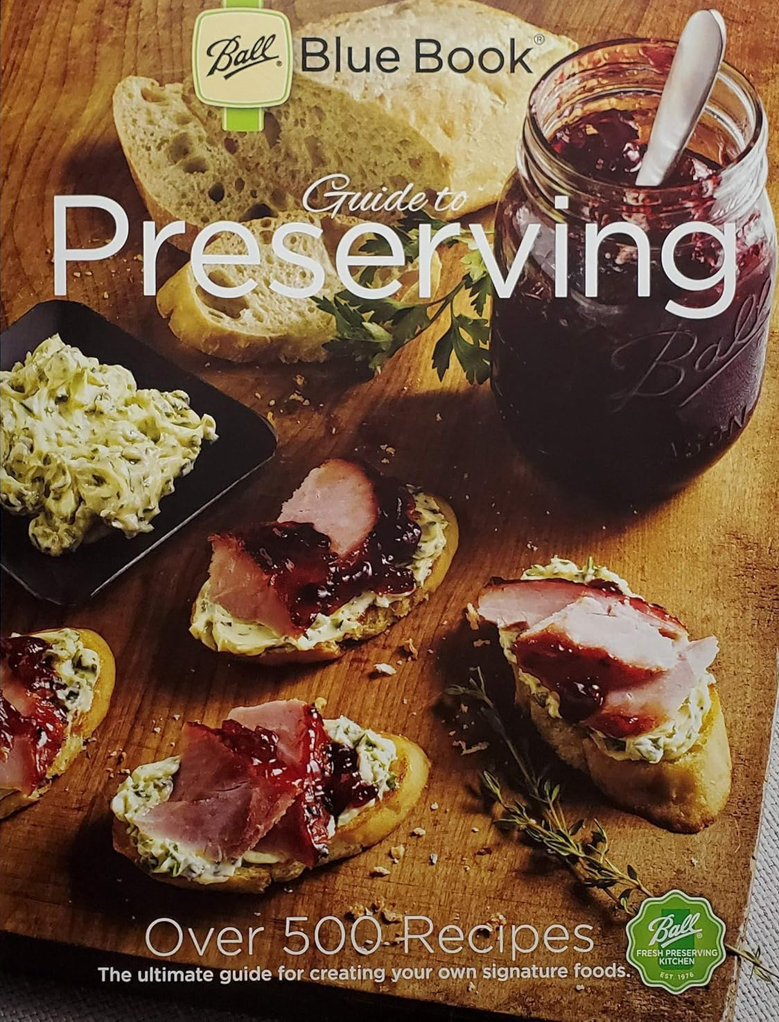
Edition 37
Edition 38
Challengesand Solutions
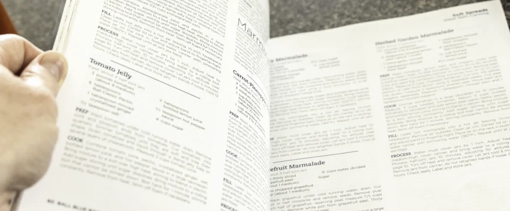
More Content, Same Page Count: The client added 40 new recipes to this edition and made a solid estimate of the total page count—but the final layout ended up two pages over. In book publishing, pages must be added in multiples of four, not individually. Because the print contract had already been finalized, adding four extra pages would have triggered a costly change order, likely increasing the production budget by thousands and requiring executive approval.
The Fix: In a single day, I reflowed content, optimized layout spacing, and fit everything in without compromising quality or legibility. We hit our deadline and avoided a budget increase.
Indexing: Indexing a 200+ page recipe book was a daunting unknown. Through a connection (via my wife), I brought in a professional book indexer who handled this crucial task efficiently — a true project lifesaver.
Highlights
Met every single deadline, even with late-stage content changes
Saved the client thousands of dollars by solving a last-minute layout issue
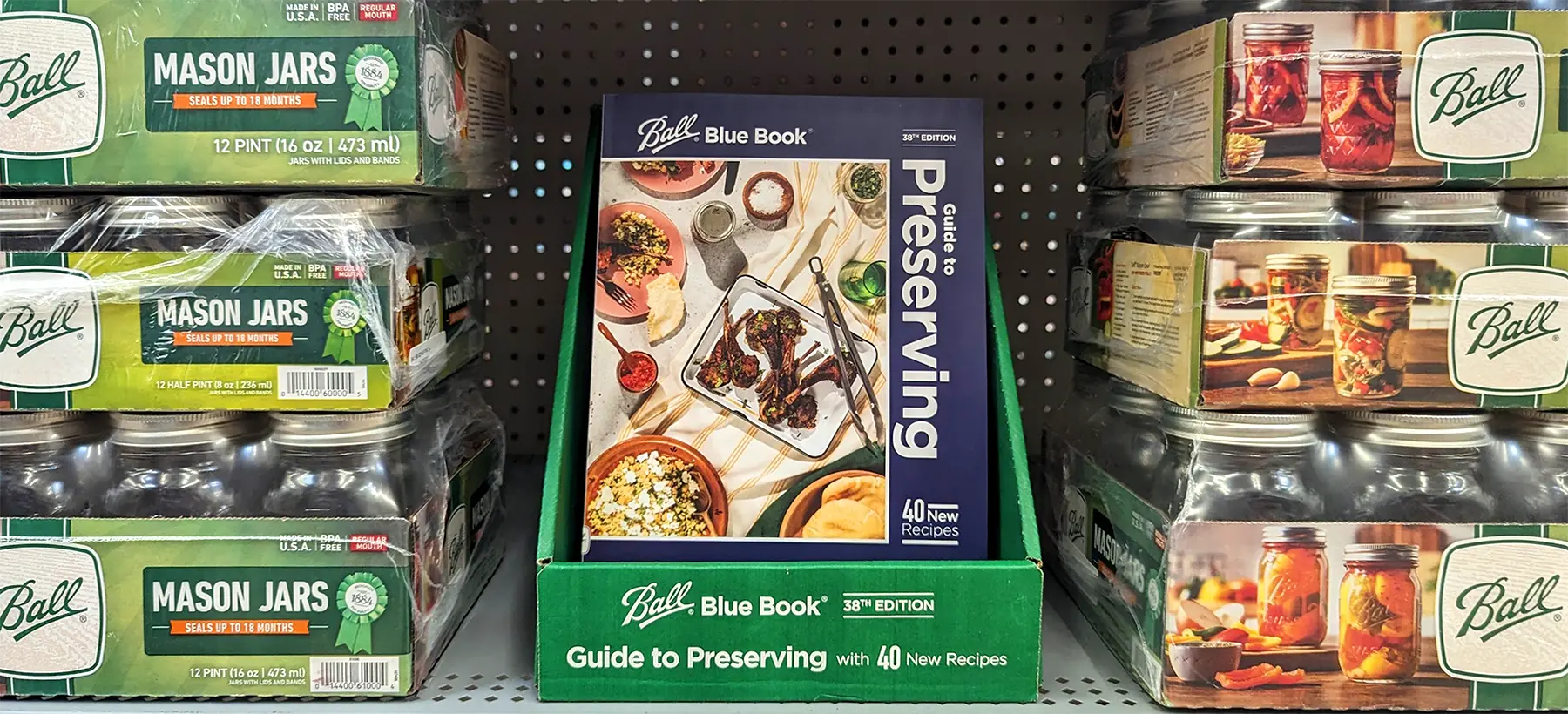
Book is now sold in most major retail stores in the canning section
Introduced a fresh, minimalist aesthetic that reset expectations for the Blue Book
Results And Reflections
While the design refresh may have flown under the radar in online reviews, the client was pleased — and the book’s enduring popularity in retail is a testament to its continued relevance. For Ball and Newell, the content is king, and our design supported it every step of the way.